#208676
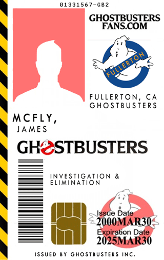
mcfly wrote:In order to try and compete with Vincenzo (whose design is great!), I hereby submit a new, simplified and hopefully more popular version of my design. "SCREEN" is where your screen name would go.
I think you should lose the "Believing you since 1984!". An ID card has to look professional. No cheesy slogans. You might as well hand the police officer your Blockbuster Video card.
#208701
RedVirtue wrote:As much as I liked the ID card with the EPA logo Ron has one hell of a point. I don't want to be a Ghostbuster in the back seat of a police cruiser.
And I want to stress, that's VERY UNLIKELY to happen. But it's a possibility. It's a possibility for that to happen with normal GB stuff - but wearing government logos only increase the chances.

Low probability, but I am willing to bet if it ever does happen someone is going to come here and complain that AJ shouldn't have sold them this because they got hassled.
#208715
I'm just wondering what government official is going to take the time and STARE at your ID badge long enough and be like "HEY YOU AINT PART OF THE EPA!"

Ya kno? And If your going around impersonating one...like flashing your badge claiming to be doing inspections at local business's or what have you...then your asking for trouble.
#208743
xtrmn8r17 wrote:I'm just wondering what government official is going to take the time and STARE at your ID badge long enough and be like "HEY YOU AINT PART OF THE EPA!"

Ya kno? And If your going around impersonating one...like flashing your badge claiming to be doing inspections at local business's or what have you...then your asking for trouble.
There are plenty of idiots out there in the real world . . .
#208752
xtrmn8r17 wrote:I'm just wondering what government official is going to take the time and STARE at your ID badge long enough and be like "HEY YOU AINT PART OF THE EPA!"
When a TSA official makes a four year old handicapped kid take off his leg braces to go through security, you can bet some authority figure would hassle somebody, at some point over a govt seal on your badge. These types of people are looking for ANY excuse to hassle us citizens and abuse their power.
http://www.philly.com/inquirer/home_reg ... rkill.html
#208919
Original ID Card.
Image
It has some color but I didn't think it was overbearing. I was going for something that reminded me of a Passport. Aside from one vocalization that this design had their vote, there is seemingly a lot of love for simple designs. So here's the new.

Simplified. I removed the colored grid that was in the background and added a globe motif. Along with other tweeks.

Image

Larger Version: http://i23.photobucket.com/albums/b364/ ... 02Fray.jpg
Larger Version with Franchise: http://i23.photobucket.com/albums/b364/ ... 02Ftom.jpg

I'm open to any constructive critisisms on the two designs. Thanks! As much as it would be cool to win and get a free card, I'm more so interested in us really having the best card our creative minds can possibly pop out. Lets see what happens. :idea:
#209010
mcfly wrote:RV - I really like that no-ghost behind the caution tape. Looks good! I think you need a spot for a franchise logo - would you just switch out the logo there?

Shane
Here is the clean version so far.
Image

This one has a franchise. Let me know what you guys think.

Image
#209158
Here's a brand new, completely original design I just whipped up.

Image

Just kidding, Vincenzo!

Actually, your design is pretty cool. No hard feelings whosever gets chosen - and there are plenty of other really nice designs too. Even with the stiff competition, I just thought I'd say that I like your design too...

...though actually, the combination of both of ours looks kind of cool! :cool:

Shane
#209168
I'm really digging Vincenzo's design.

It needs some tweaking, but definitely the hazard stripe down one side looks the best.

If we do this design, it will not be on a real Smart card. I see those things are like $2 each!
#209191
mcfly wrote:Here's a brand new, completely original design I just whipped up.

Image

Just kidding, Vincenzo!

Actually, your design is pretty cool. No hard feelings whosever gets chosen - and there are plenty of other really nice designs too. Even with the stiff competition, I just thought I'd say that I like your design too...

...though actually, the combination of both of ours looks kind of cool! :cool:

Shane
Thanks Shane, I see you managed to squeeze the ID number in there. I couldn't quite find space for it. I like a few of the designs, yours included.

How much longer until we decide AJ? Whatever we choose I'd definitely like to get a new one.
#209195
enchanted unicorn wrote:really digging all of them. the 3rd is really good on aj's id card line up there.on the third one, i wonder what the horizontal stripes would look like if they were just a color or something else besides that dang hazard stripe? it makes it too busy!!!!
Thanks for the compliment. Here's a couple images to quench your curiosity.

Image
This is with one hazard stripe removed.

Image
This is with both removed. (the bar colors can be anything.)

Image
Here is the original (with the franchise space).

Image
And without franchise. Which AJ has printed above.
#209220
mcfly wrote:I agree - especially if we won't actually have real ones. I'd rather have nothing on there than a fake smart card. =/

Shane
Yup. I put those there as a marker for real ones to be placed. I believe AJ said earlier he would be able to get some real ones.
#209221
AJ Quick wrote:I'm really digging Vincenzo's design.

It needs some tweaking, but definitely the hazard stripe down one side looks the best.

If we do this design, it will not be on a real Smart card. I see those things are like $2 each!
I think he's changed his mind! :walterpeck:

Shane
#209231
Image
hey I appreciate that you took that time to make a version just to see it. I was thinking the lowest bar would need to be the same color as the main bar above that you made yellow. They might also have a gradient to them, and maybe a color that's less loud.
I feel ok with the number of elements in your design(the globe, the bars, the chip, the logo etc.) but I still feel like they are fighting each other for dominance. I'd pick one element, make it the main feature by having the bright color on it, or the most contrast there, then make everything else more muted.. it's really coming along.
  • 1
  • 4
  • 5
  • 6
  • 7
  • 8
  • 9

I just couldn't help myself and had to add texture[…]

At the moment my interest would be what sorts fo[…]

@GBfan77 No when I turn it off it still keeps firi[…]

Just to throw my experience in there. I've bough[…]