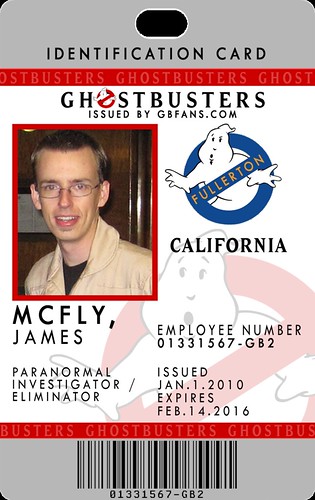
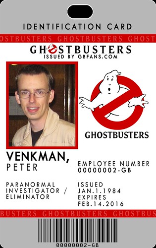
#209249
mcfly wrote:Btw, RedVirtue - since nobody else has commented on this yet, I'd like to point out your awesome screennames for the guys. Haha!! ('Cept you spelt Stantz wrong! ;-))

Shane
great point Shane, see, no one noticed that detail because the card is too busy!! and no I won't stop saying it!
#209285
enchanted unicorn wrote:hey I appreciate that you took that time to make a version just to see it. I was thinking the lowest bar would need to be the same color as the main bar above that you made yellow. They might also have a gradient to them, and maybe a color that's less loud.
I feel ok with the number of elements in your design(the globe, the bars, the chip, the logo etc.) but I still feel like they are fighting each other for dominance. I'd pick one element, make it the main feature by having the bright color on it, or the most contrast there, then make everything else more muted.. it's really coming along.
No problem. I'm open to some constructive critisism and I appreciate when I get it. Here is a look at a gradient.
Image
I plan with sticking with this scheme for now though for the most part ;) I myself don't think it's too demanding. I feel the balance of complexity and simplicity are pretty balanced imho. I think the gradient came out pretty spiffy!

I may release one more with the "Ray" plan but with a barcode in place of the smart chip. Even though I'm pretty biased with the chip. :)
Btw, RedVirtue - since nobody else has commented on this yet, I'd like to point out your awesome screennames for the guys. Haha!! ('Cept you spelt Stantz wrong! )

Shane
Haha thanks! They're fun to come up with. Man, I knew that last name didn't look right! Ah well

Image
Here's the hazard stripe one for comparison.
#209295
Alright folks. For my contributions it's come down to this.
There have been a few members that suggest the "hazard stripes" are a tired design. A couple of the last few posts have suggested not using a Smart Chip image because 1. they don't like it 2. there may be no real Smart Chip to go over it 3. another distraction / makes the card "busy". So These two next designs I tried to keep these critisisms in mind. I hope you like them.

Image
"Ray" Card with modifications.

Image
"Winston" Card. Includes the new modifications with flipped GB Logo and Franchise Logo.

Obviously we can't have two designs. So which of the two stay for voting?
#209298
The last Winston one is on the right track, I think.

Well, while I definately like supporting the GBFans website, why not move the barcode to the bottom, filling up the entire bottom length of the gold bar where GBFans.com currently sits? May I also suggest moving the No Ghost logo on top onto the gold bar beside Winston...center it below the text.

As for the franchise logos, I think I'll be in the minority when I say that they aren't necessary. Granted, my team doesn't have a franchise logo yet, but either way, it just adds another No Ghost logo.
#209493
Hmm... alright then. Here's a new design of my version, again influenced by Vincenzo's, which I like, but with my theme and some other changes. It now says "Issued by GBFans.com," has a darker red to match the no-ghost logo, changed "Identifaction Badge" to "Card," and I have removed the slogan. I've also removed the white text from the red lines, and put a faint repeating "Ghostbusters" inside it. Hope you guys like this! I'm quite pleased with the way it's turned out.

Where it says California can pretty much say whatever about your franchise.

Image
Full size: http://farm5.static.flickr.com/4045/436 ... edfa_o.png

Or for those of you without franchises (like myself) or who don't want a franchise logo on their card:
Image

Shane
#209519
Hey, that one's pretty good. I like how you put the GBFans on there. It looks less busy now, too! Think you could make the globe a little less opaque? I think it'd look great as a sort of watermark in the background. The no-ghost in the gradient bar might even look great in black and white!

Shane
#209526
RedVirtue wrote:Here is a design based on Krenzy's influence.
Image

This one is really good! Personally I like the hazard tape, but I understand the sentiment of it being "tired." Also, I can take it or leave it. :)
#209543
I like the hazard stripe too. Which is why my designs started with them. ;)

Here is the gradient gold bar:
Image

Here are two cards with the latest design, but with hazard stripes:
Image

Image

And here is a splice of the two:
Image

@McFly: Small details or even text seems to print lighter in pigment. I did make it lighter just a smidge in these last examples. It already looks pretty light on the actual printed image.
AJ Quick wrote:One of the most important things that was brought up is text size.
#209671
mcfly wrote:
Or for those of you without franchises (like myself) or who don't want a franchise logo on their card:
Image

Shane
I'm still pulling for you, bro.

Red, your design is great, too. I like the one with the gold gradient. Sorry, you hazard tape guys. I agree with mike--the gold one just looks more professional, imho.
#211328
Here is my entry.

I tried to keep the design fairly simple, so it is easy to tell what it is with a quick glance. The "no ghost" logo is where your franchise logo would go if you have one, if not then the no ghost would stay.

I also stayed away from using the Ghostbusters wordmark, and also purposely didnt use the ghostbusters font anywhere in the design. I instead chose a couple more modern looking fonts to give the card a more up to date feel.

Image
  • 1
  • 5
  • 6
  • 7
  • 8
  • 9

We're bringing you the latest updates to the GBFan[…]

The amount of people participating in the milest[…]

This is awesome, One time. I love reading explanat[…]

And, lastly, for now, the video that prompted me t[…]