enchanted unicorn wrote:hey I appreciate that you took that time to make a version just to see it. I was thinking the lowest bar would need to be the same color as the main bar above that you made yellow. They might also have a gradient to them, and maybe a color that's less loud.
I feel ok with the number of elements in your design(the globe, the bars, the chip, the logo etc.) but I still feel like they are fighting each other for dominance. I'd pick one element, make it the main feature by having the bright color on it, or the most contrast there, then make everything else more muted.. it's really coming along.
No problem. I'm open to some constructive critisism and I appreciate when I get it. Here is a look at a gradient.

I plan with sticking with this scheme for now though for the most part

I myself don't think it's too demanding. I feel the balance of complexity and simplicity are pretty balanced imho. I think the gradient came out pretty spiffy!
I may release one more with the "Ray" plan but with a barcode in place of the smart chip. Even though I'm pretty biased with the chip.

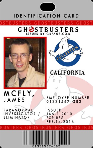
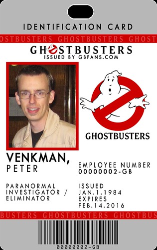
Btw, RedVirtue - since nobody else has commented on this yet, I'd like to point out your awesome screennames for the guys. Haha!! ('Cept you spelt Stantz wrong! )
Shane
Haha thanks! They're fun to come up with. Man, I knew that last name didn't look right! Ah well

Here's the hazard stripe one for comparison.


 - By hawkbatsquadron
 - By mrmichaelt
 - By prodestrian