Hiya all. I have started talking with a few Australian ghostbusters about a logo for Perth WA, or greater WA. Something similar to all the US ghostbusters franchises that do the convention and charity circuits. Well one thing led to another and all of a sudden, I have almost 10 prototype logo designs to choose from to take to the next step in design.
Now I definitely don't want to be the one who picks the final design, without at least hearing the opinions of the fellow boys in grey. So what do you reckon? Let me know if you like a design, or have a different concept I can work towards.
I had in mind something akin to number 4 (plain red on WA outline), but I liked number 5 as well, and was wondering what the two combined would look like (and not purple ).. namely the red background blending into no-ghost with a swan logo, or a variant with blue replacing all the red. If my main computer was working at this moment I'd photoshop it.
The second to last one is also kinda interesting as well to be honest, but for some reason I'm kinda put off of the whole southern cross aspect, I suppose because I think the Swan closely relates to Perth then the cross... plus we can probably modify it for those not living in the city
If I'm not making any sense, I apologize as I've had barely 4 hours of sleep in the last 30+
Re: Ghostbusters logo for WA.
Posted: February 14th, 2011, 1:02 pm
by Vincenzo330
I like this one
Re: Ghostbusters logo for WA.
Posted: February 14th, 2011, 2:19 pm
by Charlie Richter
I'm going to wait and see where it goes from here.
I do agree with Vin, I like that one, its nice and simple.
Re: Ghostbusters logo for WA.
Posted: February 14th, 2011, 10:29 pm
by sorak
ganthorion wrote:I had in mind something akin to number 4 (plain red on WA outline), but I liked number 5 as well, and was wondering what the two combined would look like (and not purple ).. namely the red background blending into no-ghost with a swan logo, or a variant with blue replacing all the red. If my main computer was working at this moment I'd photoshop it.
The second to last one is also kinda interesting as well to be honest, but for some reason I'm kinda put off of the whole southern cross aspect, I suppose because I think the Swan closely relates to Perth then the cross... plus we can probably modify it for those not living in the city
If I'm not making any sense, I apologize as I've had barely 4 hours of sleep in the last 30+
I think I understand where you are coming from from your idea, I'll see if I have time to make up a rough of that tonight.
I do like the concept of working the state flag into the design, however personally I think it doesn't look that flash. To me it looks like we are trying to put two logos into one design. Need to think of a better way of framing it maybe...?
Re: Ghostbusters logo for WA.
Posted: February 15th, 2011, 7:51 am
by sorak
ganthorion wrote:I had in mind something akin to number 4 (plain red on WA outline), but I liked number 5 as well, and was wondering what the two combined would look like (and not purple ).. namely the red background blending into no-ghost with a swan logo, or a variant with blue replacing all the red. If my main computer was working at this moment I'd photoshop it.
this what you meant Ganthorion?
Re: Ghostbusters logo for WA.
Posted: February 15th, 2011, 9:05 am
by ganthorion
sorak wrote:To me it looks like we are trying to put two logos into one design.
You mean apart from the WA and the southern cross And yeah on second viewing that logo does look a bit naff, but i have an idea for it
As soon as I can get this bloody machine running again I'll work some photoshop magic and have a play around, but I do like the wa outline
Re: Ghostbusters logo for WA.
Posted: February 18th, 2011, 12:46 am
by ganthorion
Here are a couple of things I've butchered, I mean have just worked on!!!
Any thoughts?
Re: Ghostbusters logo for WA.
Posted: February 18th, 2011, 1:24 am
by sorak
I can sort of see where you are coming from in your design adaptions. Though I am not so sure of the full blue no ghost logo. my mind is automatically associating the blue with cold/frostbite, which is something that we are SO NOT here in Perth right now.
swan.jpg
cross.jpg
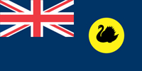
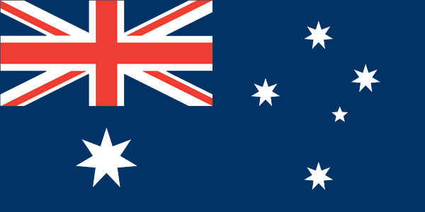
The main reason I went with blue against the red no ghost logo was so I could keep a subtle hint to the union jack, via the colour scheme. which is also why I have used a white outline in the design too. Just my personal default I went with. WA state flag Australian National Flag
If we were to go with a solid colour, personally I reckon we should stick to the standard red colour from the no ghost logo. Same as other ghostbuster groups have done in the past.
Re: Ghostbusters logo for WA.
Posted: February 18th, 2011, 1:38 am
by ganthorion
Yeah, I think it's the Southern Cross flag itself is what immediately comes to mind, rather then the actual Australian flag, so I kept going back to the blue. The ones I did were just to see what it would look like, with no real intention beyond my own curiosity.
I think the red circle within the outline just is a little bit too cluttered and is a tad distracting from the WA outline (which should be the main element, or at least after No-Ghost). I mentally keep coming back to the plane red background (no4?) but with a larger ghost to fill up some of the negative space within the state itself (like some of the other group logos).
Maybe a swap with GB2 style (with an alteration like that other group logo, but maybe a thumbs up or something), or a completely new no-ghost might also help it out a bit as well.
Re: Ghostbusters logo for WA.
Posted: February 18th, 2011, 1:44 am
by sorak
ganthorion wrote:Maybe a swap with GB2 style (with an alteration like that other group logo, but maybe a thumbs up or something), or a completely new no-ghost might also help it out a bit as well.
I am thinking of a possibly designing a new no ghost stance for our own use. But I would like to know what is our backdrop for him first, before designing anything in depth. Its the main reason I tried gilpin's pke surge logo out, just to see how much of a difference it would make.
Re: Ghostbusters logo for WA.
Posted: February 18th, 2011, 1:53 am
by ganthorion
sorak wrote:Its the main reason I tried gilpin's pke surge logo out, just to see how much of a difference it would make.
Yeah I think that was a good idea
Re: Ghostbusters logo for WA.
Posted: February 18th, 2011, 2:05 am
by sorak
ganthorion wrote:I think the red circle within the outline just is a little bit too cluttered and is a tad distracting from the WA outline (which should be the main element, or at least after No-Ghost). I mentally keep coming back to the plane red background (no4?) but with a larger ghost to fill up some of the negative space within the state itself (like some of the other group logos).
Did you mean something like this?
scale.jpg
Re: Ghostbusters logo for WA.
Posted: February 18th, 2011, 12:02 pm
by ganthorion
sorak wrote:Did you mean something like this?
scale.jpg
Hmm.. yeah I think I prefer that
Re: Ghostbusters logo for WA.
Posted: February 18th, 2011, 4:38 pm
by Davros
hmm, #3 or 4 for me so far, leaning toward 4
Re: Ghostbusters logo for WA.
Posted: February 18th, 2011, 6:07 pm
by sorak
ok. so it seems we have a few stand out favourites now, so I'll just make it easier for scrolling reasons. If I am understanding everyone's opinions thus far, these are preferred concepts.
Re: Ghostbusters logo for WA.
Posted: February 28th, 2011, 1:07 am
by ganthorion
Hey guys, lets get this ball rolling!
My vote is for 4A, which if you've read my previous posts you would have probably guessed that Please any feedback will be greatly appreciated so we can get a design up, running and in production in time for Supanova
Oh, also me and sorak have been talking about putting in an order of Flightsuits from here for the WA crew, mainly so we can all have a standardized look (well at least as far as uniforms are concerned) that is also tailor made and comfortable to wear during our outings
Re: Ghostbusters logo for WA.
Posted: February 28th, 2011, 7:10 am
by sorak
Ok, so... Here is where the official vote starts:
DESIGN 4:Sorak DESIGN 4A:ganthorion DESIGN 5:NONE
Although I do prefer the design of #5, I realised today that if we did go for the blue wa, it would not look as good depending on the flight suit colour chosen. If used on a GB2 style navy blue, it would blend in and be lost. so my vote is now set on #4 - I feel #4a hides the WA coast too much making it hard to pick out.
Please note that if you tell me your vote or explain your reasons outside this thread, it will not count! Though I am the person that started this thread and designed these logos, I am not the one in charge here. A lot of you here are a lot more present in the fandom than me, and I don't want to be the made the one in charge just because the ball started rolling at my feet. Share your thoughts with everyone, and not just me.
Additional: "Wohooo, post 100 on the forum!!!" XD
Re: Ghostbusters logo for WA.
Posted: February 28th, 2011, 8:47 pm
by Dr Miller
I'm putting in a vote for 4A. I think it's true to the colours of the original logo, and little things like where the states outline crosses therough the ghosts hands and head are the same points for the priginal logo thanks!
Re: Ghostbusters logo for WA.
Posted: March 3rd, 2011, 10:28 pm
by sorak
VOTES: DESIGN 4:Sorak DESIGN 4A:ganthorion, Dr Miller DESIGN 5:NONE
Re: Ghostbusters logo for WA.
Posted: March 4th, 2011, 1:46 am
by Charlie Richter
Dr Miller wrote:I'm putting in a vote for 4A. I think it's true to the colours of the original logo, and little things like where the states outline crosses through the ghosts hands and head are the same points for the original logo thanks!
I would say that 4 would be closer to what you are getting at there.
I'll vote 4A.
Re: Ghostbusters logo for WA.
Posted: March 4th, 2011, 8:13 am
by sorak
VOTES: DESIGN 4:Sorak DESIGN 4A:ganthorion, Dr Miller, Charlie Richter DESIGN 5:NONE
Re: Ghostbusters logo for WA.
Posted: March 4th, 2011, 3:47 pm
by Davros
yeah, 4A for me also
Re: Ghostbusters logo for WA.
Posted: March 4th, 2011, 5:06 pm
by sorak
Well, I think that pretty much wraps up the voting. A clear favourite is now easy to see and I think its time to call it. A big thanks to everyone who posted here and shared their opinions and ideas. And the winner is:
VOTES: DESIGN 4:Sorak DESIGN 4A:ganthorion, Dr Miller, Charlie Richter, Davros DESIGN 5:NONE
Re: Ghostbusters logo for WA.
Posted: March 4th, 2011, 10:45 pm
by ganthorion
Sweet, now that's over we can focus on other things... like the uniform
Re: Ghostbusters logo for WA.
Posted: March 5th, 2011, 1:28 am
by sorak
hehe uniforms... well as you said earlier, we have had small talks about where we can get flightsuits at an affordable rate, that are also of a good quality. check the site out here.
The flight suits are 65/35 polyester/cotton twill so nice and breathable. Another cool thing is that they are a good quality that have all the overkill pockets that the originals had. My only question is... what colour? As in do we keep to the khaki colour suit, or go for something new for us? It would be awesome if we all had a standard uniform and colour scheme to go on our WA GB uniforms.
Re: Ghostbusters logo for WA.
Posted: March 5th, 2011, 6:38 am
by ganthorion
I like the look of the Sage(green) as a nice alternative for the Khaki, bringing in some of the 'Green and Gold' back into it. I'll definitely be ordering Khaki for my GB1 stylings, but would love something a bit more unique to the group.
Re: Ghostbusters logo for WA.
Posted: March 7th, 2011, 12:31 am
by sorak
Awesome, I kind of wouldn't mind a green (sage/olive green) uniform as a standard WA colour. Though I wouldn't mind having a tru spec khaki uniform.
Another place we are thinking of buying flight suits from is here. click here
it will work out to be less then $50 AUS per uniform, but before we get a order posted, if people can discuss if they want to use a different colour other than the standard khaki?
btw, I did another tweek of logo (in regard to position) just to kill some negative space.
Re: Ghostbusters logo for WA.
Posted: March 7th, 2011, 8:27 pm
by Charlie Richter
Not too keen on a Green/sage suit. At this stage I'd would much rather stick with the Khaki.
Re: Ghostbusters logo for WA.
Posted: March 9th, 2011, 2:25 am
by ganthorion
Charlie Richter wrote:Not too keen on a Green/sage suit. At this stage I'd would much rather stick with the Khaki.
That's cool, was talking to Dave and he is pretty much said the same thing. Me and Sorak were thinking of making an 'acclimatized' pack to handle the extremities of the heat in this country (extra fans and heat sinks,etc), and having differing uniforms to reflect that. We think we all still want khakis, so that isn't in dispute, but an alternative would be pretty nifty (akin to the charcoal in GBII).
Oh, and here is a picture of the Sage (albeit a lighter shade) being worn by our very own Sorak (excuse the poor camera work, it was on my crappy phone).