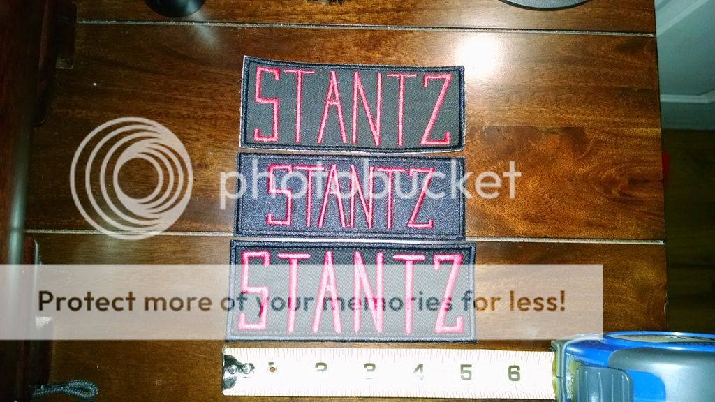
The GB1 originals were hand-made. The measurements and proportions vary between the different names, and even within the names:

If you compare the reference images to the nametags AJ sells, you can see that they're true to the proportions and varying lengths of the originals. The measurements come from one very specific screen-used nametag that we were lucky enough to have close-up reference shots against a risptop background for scale, giving us the 2.2" height (mil-spec cotton ripstop fabric is a 1/4" grid):

Hell, even the nametag fonts are just "close enough" because no two of the handmade letters are identical. Check the differences in the "A" in Venkman or the "R," "D," and "N" in the other names. Each letter is based on a specific character from a specific nametag, usually the ones we just happen to have the best reference shot of. It's like trying to come up with definitive specs of someone's handwriting. Nonetheless, the fonts do exist; I host one that I made on my site, and I believe JayM created one as well.
While we're at it, not even the No-Ghost logo patches were identical. Look at the differences in the eyes, fingers, etc.:

In short, we use words like "reasonably accurate" and not a definitive list of measurements because there is no such thing. If you want the closest "sanitized" machine-embroidered approximation of the specific set of rough, hand-made originals that we have reference of, just comparing the reference to AJ's should be evidence enough that his are the most accurate.
If it's down to being cheap, a newbie, or just not looking into it enough, we can't save everyone. Though, if you're going to lose sleep over everyone else's stuff not being as accurate as yours, you might just be looking into the wrong fandom.
Want to build your own uniform accessories?
Check out my
Templates, Patterns, & Downloads!


 - By Threadender
 - By tylergfoster