Sav C wrote:Hi everyone,
One complaint that seems to come up a lot with Ghostbusters II is the Statue of Liberty and how she doesn't actually have feet, yet becomes able to walk.
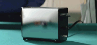
It seemed like an odd complaint since the slime obviously manipulates objects, like the toaster which grows feet so it can dance:
The tub, which wouldn't bend like that without the influence of slime:

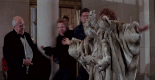
The mink coat:
So wouldn't it make sense for the Ms. Liberty to gain the ability to walk?

Tell me what you think! Thanks.

Yeah I agree.
The Staypuft scene, although iconic was borderline childish. The liberty statue was just childish and really relegated GB2 to kids movie territory towards the end in my opinion.
The statue is a wireframe metal structure with overlying panels. It has no skeleton or joints or even feet. To have it just hover over the streets would have been more "realistic" eerie Twilight Zone rather than the Scooby Doo kids effect we saw in GB2.
Yes I realise I'm talking about the "realism" of a possessed 150ft statues' dynamics of possession, but as we all know these things affect the "tone" of a movie. Hellraiser is equally improbable but scares the crap out of you.
As for the grading. I'm a commercial advertising photographer who lives in Photoshop. We all have a moment where everything you continue to adjust starts to be over the top. It starts to look less and less real. The '14 BR toned the "color corrections" applied between 99-09 down, so that the movie looked more like the original release.
Sure, some things needed tweaking, the blown out whites in the rooftop scene, etc. But on the whole all the post 99 releases look faker to me in terms of color.
Its hard to explain but the tonal gamut and contrast ratio of the effects/ghosts/beams appears mismatched to the film grain of the scene itself.
Like in the cleaning lady blasting scene, at the ISO level (film sensitivity) and contrast ratio (lighting) used in that scene, the sudden appearance of the beams would just look like a blindingly bright predominantly whitish / orangish color.
The later releases add very detailed bit depth, hues and tonal range to effects like that, and some ghosts for example, where its mismatched to the film stock. Sure the remastered effects are rendered in 32-bit software with huge gamuts... But the original film stock would never have displayed that detail!
At the grain level, focus and lighting visible in a scene, the VFX could not possibly be there in real life the way it looks on the film. It's evidently painted on, and takes you (even if a little) out of the immersion. (Subconsciously for a non-professional image-maker I suppose.)
Like getting a 0.2 megapixel Sony Ericsson phone from 2002, taking a 640x480 pixellated video with it. Blow it out to 4K resolution (it will still look as bad, as you cannot create new information by simply enlarging a source), and then go and add 4K hyper detailed effects to it. It will obviously look fake.
I put it down to messing with something too much where you begin to lose sight of the forest through the trees. It's why the 99 DVD release looks most "realistic" or "vfx matching environment" to me. I think those original cinematographers and vfx guys knew what they were doing.
PS: I'd love to see your cinematography write up!


 - By hawkbatsquadron
 - By mrmichaelt